I was given the opportunity to design a new logo for the local community theatre group, Washington County Theatre. I really wanted to go with something that was clean, modern, and elegant looking so I drew inspiration from modern theatres.


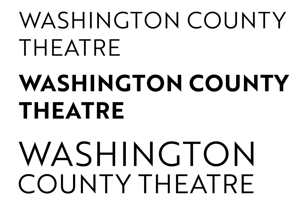
I started by playing around with type. I wanted to aim for a slick logotype and I knew that a sans-serif font could portray a good feeling of contemporary arts and theatre. I settled on the font Brother 1816 and I experimented with both styles and layout.
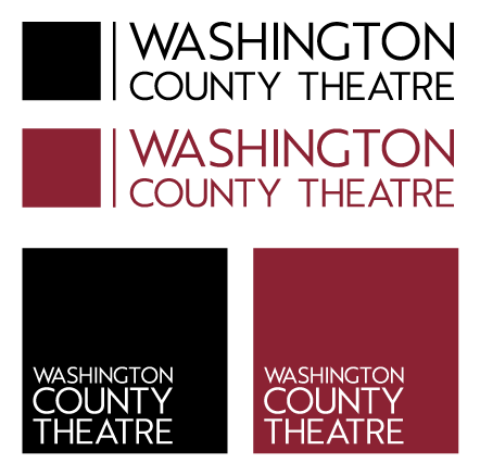
I was happy with the font and a nice centered and stacked layout. I played around with the idea of altering the type but I liked the idea of an icon of sorts. I placed squares as placeholders until I could figure something out. I definitely thought of the logo of the Madison Square Garden Company and how it had a square icon next to the type but I wanted something related to acting. I also explored the idea of a square logo which would work well with social media.
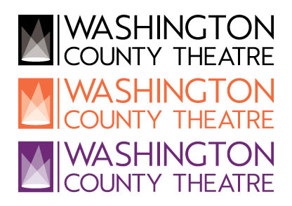
Of course I thought about using the tragedy and comedy faces that are commonly associated with acting, theatre, and the arts but I wanted to modernize it. After researching more into theatre, I thought about equipment and lighting. A rectangular icon would work just as well as a square one, if not better. I decided that three spotlights could make an iconic look while being abstract enough to portray other ideas. The three spot lights idea rose from trying to make an abstract "W" of sorts but I liked the idea of three lights converging and the opacity of each shape creating interesting shapes. Staggering the lights made it a bit less uniform and leaning towards the abstract but the general idea
of spotlights still rang true.
of spotlights still rang true.
Once the design was approved, I had to explore color choice. I really liked the clean look of the black but I wanted to look into more colorful options. This was for a center for art after all. I started with orange; a vibrant and happy color, orange was full of energy. Orange on white would be a nice contrast that could catch ones eye as well. The icon, while representing lighting, also made an intriguing crown-like icon and so I explored with using purple. A royal and elegant color that still had a lot of energy would be great to represent something like a theatre.